WinForms UI Controls
The controls on this page are my personal controls that I have created and use in
my applications. If you use any of these controls in a commercial environment then
all I ask is that you link back to this site.
All these controls are written in my primary language of VB using Visual Studio
2008. If you want the code in C# then just paste the code it into any online
converter like this one... Devleoper Fusion
If you're new to custom programming then my hope is that you take a close look
at the OnPaint() function and see how these controls are built. It is very
easy to inherit from existing controls or to even build one from scratch.
In order to use these control just add the class to your project and recompile.
It will then show up under the projects components in the toolbox. Then just
drag and drop onto your form.
If you have a control you wish to submit just email it to me and I will give you
full credit.
If you have a simple control you would like written then email me and I will see
if I have time.
Sample Application
I was recently asked if I had any sample applications showing how I setup the controls
to get the desired look so I decided to put all the controls onto one project so
you can see how I setup the controls. This sample app contains all the controls
on this page so you don't have to download them individually.
Download Sample Application Source
RoundedGroupBox

I created this control due to a lack of good grouping controls in Visual Studio.
I was tired of the usual single line frame control that's been around for years
so I came up with this replacement. The standard Label control also lacks
the ability to change the border color so this is an excellent replacement when
you need to spice up a page. This is my most heavily used control and I think
you will find many uses for it like I have.
Download Source (1.1)
Version 1.1 (7/21/2011)
Ater using this control quite a bit building a Programmer utilty, I found I needed
to add a few features to it. One issue that came up was a problem with Tabbing.
You couldn't Tab out of the control. It would just cycle back to the first
control in the box. This was brought to my attention by Tony who stopped by
the site. The only way I could fix this was to inherit from the stock groupbox.
I later ran into a case where the stock groupbox had flicker problems when resizing
the form. I only noticed this when a stock groupbox has a transparent background.
This gave me the idea to allow my group box to use the built in drawing of the stock
groupbox and it magically fixed the Flicker problem. So, I added a GroupBoxStyle
property so you can toggle between Standard and Extended views.
Here is a screen shot of my programming utility. This uses the groupbox quite
a bit along with the ribbon control.
View Screenshot...
whats new...
- CaptionOrientation - This property allows you move the caption area so it docks
on the Top, Left, Righ, or Bottom.
- CaptionPadding - This allows you to add some spacing so you can fine tune the positioning
of the Caption Text. Be sure to check these values when changing the Orientation
to Left or Right.
- GroupBoxStyle - This property allows you to toggle between the standard and extended
drawing teniques of the groupbox. I ran into a case where the stock groupbox had
flicker problems but mine didn't.
- Added two new gradient options called HorizontalGlow and VerticalGlow. This
draws the gradient from the center outwards in the direction specified.
- Fixed Tabbing issue by inheriting from GroupBox instead of UserControl.
- Fixed a couple minor bugs here and there in the drawing function.
Version 1.0 (2/11/2010)
The Group Box supports many properties to adjust the Visual layout...
- BackgroundColor / BackgroundColorGradient - This property allows you to create
a gradient pattern inside the frame by blending one color to the other.
- BackgroundGradientMode - Sets the type of gradient to use (Vertical, Horizontal,
Diagonal, None)
- Caption - The text to appear in the caption area
- CaptionAlignment - Set the Justification of the caption text (Left, Right, Center)
- Corners - This property allows you so specify which corners to round. You
can specify any variation you like
- CornerRadius - Set the size of the corner radius
- CaptionBackColor - Sets the background color of the caption bar
- CaptionHeight - Sets the height of the caption bar
- CaptionVisible - Shows or hides the caption bar
- DropShadowThickness - The thickness of the drop shadow
- DropShadowVisible - Shows or hides the drop shadow
Bindable ImageListbox

Download Source
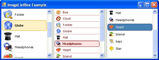
One thing that has always frustrated me about the stock Listbox control is that
you can't change anything about the selected item style. I hate that blue
background highlight color, and so, I had to build one myself. I also needed
to be able to specify an image so this became a multi-purpose control rather quickly.
To use this as a standard listbox just leave the ImageMember field blank.
This control also allows you to scale the image to any size you like. The
ImageSize property controls the display size of the image. If the image size
differs, it will be scaled.
3/1/2010
After some serious testing of my application I found this control suffered from
the notorious "Listbox flicker" whenever the control was resized or scrolled.
This is due to the control always painting the entire background prior to calling
the OnPaint(). This means that it never took advantage of the "OptimizedDoubleBuffer"
style for smooth painting. So, to get around this, I had to ignore all WM_ERASEBKGND
messages and simply paint the background myself in the OnPaint(). I also ran
across a situation where I needed to bold the selected item so I had to add a new
SelectedFont property. I decided to add a SelectedForeColor property while
I was at it. I also discovered that I wasn't dithering the items when
the control is disabled so this was fixed.
Ver 1.1 (3/1/2010)
- SelectedFont - Sets the font attributes for the selected row.
- SelectedForeColor - Sets the forecolor of the selected row.
- RowHeight - I removed this property since the stock ItemHeight property worked
just as good. Just replace it with the ItemHeight propery.
- Control will now dither all items when the control is disabled.
- Fixed the "Listbox flicker" problem when scrolling or resizing.
- Fixed bug in Paint event that cause error when using the control in unbound mode.
- Added ability to bind the image to either an Image field or a binary field (sql
2000).
Ver 1.0 (2/12/2010) - Inital release
- ImageMember - Identical to the DisplayMember and ValueMember fields, This specifies
the column name in the database for binding the image.
- ImageSize - Specifies the size the image will be scaled to.
- RowHeight - Allows you to manually set the row height.
- RowDividerVisible - Turns on or off the row dividers.
- RowDividerWidth - Specifies the width for the row dividers
- RowDividerColor/RowDividerColorGradient - Allows you to create a gradient pattern
for the divider line by blending one color to the other.
- SelectedBackColor - Sets the background color of the selected row
- SelectedBorderColor - Sets the border color for the selected row
- SelectedCornerRadius - Sets the corner radius for the selected row so you can have
rounded corners
Bindable CheckListBox

Download Source
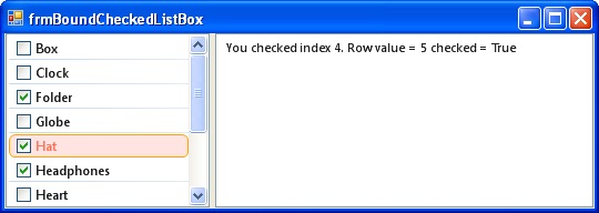
This control is almost identical to the ImageListBox control above. You can bind
the checkbox to a database field to control the check state of each item.
The field can be a boolean, bit, or any field that contains a value. If the
field is null or a zero then the checkbox is unchecked. Any other value and
the checkbox is checked.
Ver 1.0 (3/1/2010) - Inital release
- CheckboxPadding - Specifies the left and right padding on each side of the checkbox.
- CheckValueMember - Identical to the DisplayMember and ValueMember fields, This
specifies the column name in the database for binding the checkbox value.
- RowDividerVisible - Turns on or off the row dividers.
- RowDividerWidth - Specifies the width for the row dividers
- RowDividerColor/RowDividerColorGradient - Allows you to create a gradient pattern
for the divider line by blending one color to the other.
- SelectedBackColor - Sets the background color of the selected row
- SelectedBorderColor - Sets the border color for the selected row
- SelectedCornerRadius - Sets the corner radius for the selected row so you can have
rounded corners
- SelectedFont - Sets the font attributes for the selected row.
- SelectedForeColor - Sets the forecolor of the selected row.
- CheckChanged() - This event is raised when the check state - This event is raised
when the check state of an item is changed.
ImageButton

Download Source
This is an image button that duplicates the button on the Ribbon control.
I needed a button that looks and functions like the Ribbon but was not a part of
the Ribbon. This is completely configurable in all respects so its not simply
a button replacement. This is also a good example of how to implement complex
properties using TypeConverter.
Ver 1.1 (1/28/2015)
This has become my primary button for most applications. You have complete control of every aspect of its appearance. StandardButtonStyle,
PressedButtonStyle, HoverButtonStyle, CheckedButtonStyle. Each style has multiple color options so you can create Glossy effects if you desire.
New Stuff...
- TextImageRelation - Allows the ability to position the image and text in various
arrangements.
- TextAlignment - Added the TextAlignment property to give more control over where the text is positioned based on the various positions of the image
Ver 1.0 (4/28/2011) - Inital release
- CheckboxPadding - Specifies the left and right padding on each side of the checkbox.
- CheckValueMember - Identical to the DisplayMember and ValueMember fields, This
specifies the column name in the database for binding the checkbox value.
- RowDividerVisible Turns on or off the row dividers.
- RowDividerWidth - Specifies the width for the row dividers
- RowDividerColor/RowDividerColorGradient - Allows you to create a gradient pattern
for the divider line by blending one color to the other.
- SelectedBackColor - Sets the background color of the selected row
- SelectedBorderColor - Sets the border color for the selected row
- SelectedCornerRadius - Sets the corner radius for the selected row so you can have
rounded corners
- SelectedFont - Sets the font attributes for the selected row.
- SelectedForeColor - Sets the forecolor of the selected row.
- CheckChanged() - This event is raised when the check state of an item is changed.
More controls comming soon...